
Updates to our vendor comparison charts
 For the past ten years we've been using checkmarks (with plus and minus indicators) in our comparative ratings and scenario charts. Some of our research customers have asked for a more visually revealing approach, and we've settled on "harvey balls."
Harvey balls also bring the advantage of indicating five levels rather than four, which is useful differentiation as we cover ever more vendors.
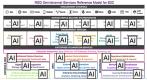
We're already rolled them out in our recently updated Digital & Media Asset Management Report. The sample you see here is a partial slice from that report, contrasting three DAM vendors in one subcategory of criteria. We're busily applying them this month to all our other research.